Learning to Blog

As I realized my blog posts were just huge walls of text, I have started to try to incorporate more pictures - more images to be precise - to my pages. I started out with lots of screenshots due to the subject matter I was taking about. However, as I wrote more about living life, I found fewer and fewer pictures. Most of these pages, so far anyway, are on thought provoking concepts, which are hard to provide a picture of. So I started at least trying to have a banner on every page.
There is a problem with banners, and many other images, however; they are not a standard size. Look back to my previous post. The banner is extra tiny. Other pages have them of all different sizes. I thought about fixing it, but instead I kept it as is - a reminder of where I came from and how far along I have come. It was also the genesis for this post.
When blogging, images matter. They need to be clear, related, and legally obtained. I will admit that a few of the initial images I used were not legally obtained - it wasn’t something I though about at first; but I purged them as much as I could remember and replaced them. If I missed any, and you know where it came from, please let me know. Depending on source, sometimes it is as simple as posting back to the source to get legal. Other times, a simple email requesting rights is enough. Worst case, I replace it with one that is legal.
I always get images I know are legal now, as I build most of them. I take a free stock image I find (usually from Canva.com) and then add it as an element to what I create. This provides some additional benefits such as knowing it is original and legal (as long as the image and elements used are legal). It also allows me to control sizes, so I can make my banners, for example, a consistent size.
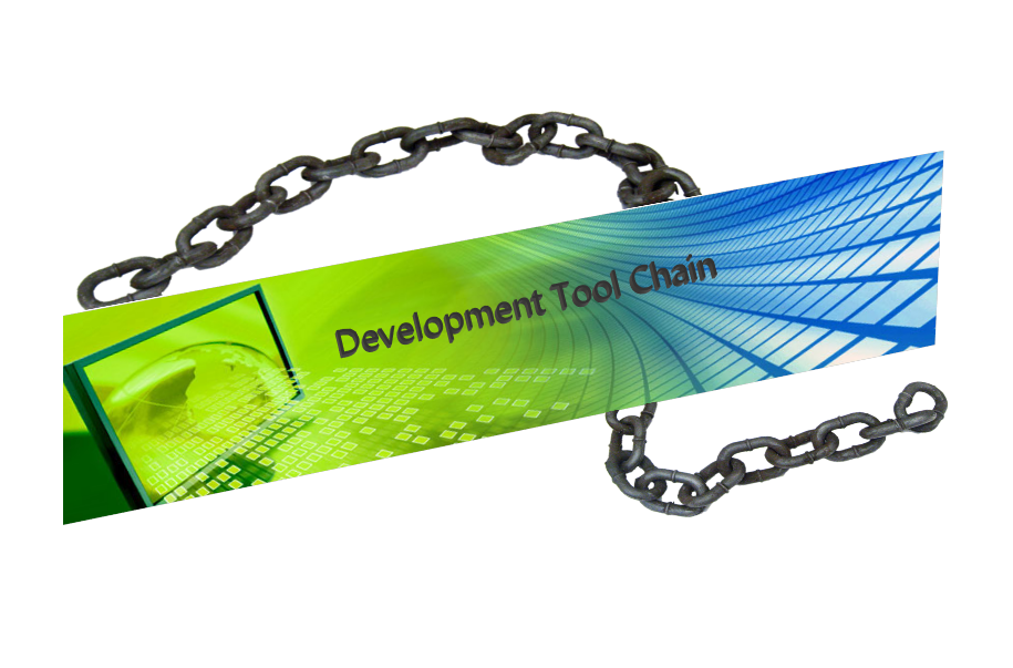
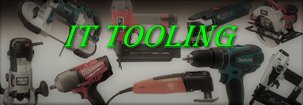
Since I am using Jekyll, I am trying to find a default size that works well with the template being used so I can set that as a standard. Here are some samples I created for pages in the past (not all were actually used - yet):
560x214

915x603

1024x356

1200x230

As you can see, they vary widely; and how effective they are, no doubt, is due largely to the size they end up. Some, like the Development Tool Chain banner are necessarily tall due to the way it was made. Others, like the Platform Tools, allows it to use very little vertical screen leaving more text without scrolling. But there is no reason any of them should have different widths. Similarly, and not coincidentally, the fonts are all different sizes. Sure, the font family plays a part in that, as well as in conveying some of the tone of the article; but they should at least be the same size for consistency. Of course it doesn’t help that no matter what size is used, they all seem to be scaled to fit. The default size for blogging according to Canva.com is 560x315. I find this way too short and tall. So far, I like the results of the SoundCloud Banner size (2480x520 px) and a print size of 72 px for Headings seems about right. Subheadings should be 3 sizes smaller than their parent heading size (So the subtitle would be 48, and the byline would be 32). It may not work for all banners, but I will start there and tweak it as I go until I find what works for my site.
As I gain experience, I will come up with a consistent size (or set of) for all my images, I think, as well as other elements on the page; but until then, at least a consistent banner width and text size should be a minimum mandatory design decision. What about you? Are there other elements that need more consistency? Is there anything specific you don’t like about what is being presented so far?
P.S. - Since this is the internet, here is the obligatory cat pic:

